The One UI 7 Notification Panel Problem
Samsung's One UI 7 update brought several welcome improvements, but one particular change has left many users frustrated and confused: the separated notification and Quick Settings panel . This redesign, which makes separate areas to pull down for notifications or Quick Settings, has been met with significant criticism from long-time Samsung users who found it "not intuitive" and contradictory to "decades of Android's design and our ingrained muscle memory" .
While Samsung likely intended to make both panels quicker to access, in practice, many users report the change creates more frustration than convenience. The good news is that if you're among the many who dislike this new default behavior, it's remarkably easy to fix and return to the classic unified panel system.
Why This Design Change Frustrates Users
The Problem
The separated panel system requires users to remember which side of the screen to swipe from: right side for Quick Settings, left side for notifications . This creates several usability issues:
- Breaks years of Android muscle memory
- No visual cues that anything has changed
- Difficult to use with one hand on large phones
- Accidentally pulling wrong panel frequently
- Creates inconsistency with previous Android versions
The Solution
Reverting to the classic "Together" mode restores the intuitive notification panel that Android users have loved for years:
- Single swipe down for notifications
- Second swipe (or two-finger swipe) for Quick Settings
- Works exactly as it has for previous Android versions
- No need to target specific screen areas
- Maintains consistency with muscle memory
"It's frustrating and annoying. Because your brain doesn't flag anything as different, you do the same movements you've always done, but something different happens. When that happens, you may feel annoyed. Slowly, your experience gets worse."
How to Fix the One UI 7 Notification Panel
Fixing this frustrating design choice takes less than a minute. Here's the simple step-by-step process to restore the classic notification panel behavior:
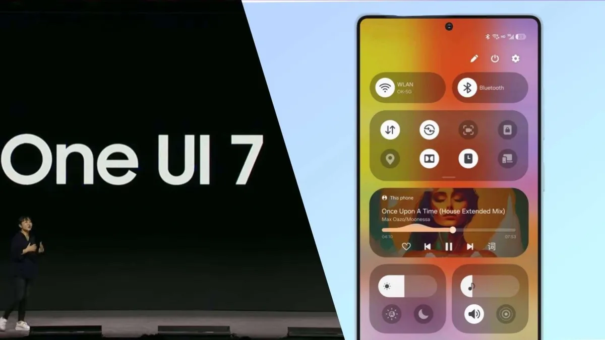
Access Quick Settings Panel
Swipe down from the right side of your status bar to open the Quick Settings panel. You need to use the right side specifically since that's where the Quick Settings now live by default .
Open Panel Settings
Tap the pencil icon in the upper-right corner (next to the power icon) to edit your Quick Settings, then select "Panel settings" from the options that appear .
Change to Combined Layout
In the Panel settings menu, change the option from "Separate" to "Together." This single change will immediately revert your notification panel to the classic Android behavior .
Enjoy Your Fixed Panel
Once changed, you can now swipe down from anywhere on the status bar to see notifications, then swipe again (or use two fingers) to access Quick Settings - just like older Android versions.
Bonus: Left-Handed User Option
If you actually prefer the separated panels but want them better positioned for your handedness, One UI 7 offers a handy customization. Instead of changing back to "Together" mode, you can keep "Separate" enabled but move the Quick Settings panel to the left side .
- Keep "Separate" selected in Panel settings
- Toggle "Quick panel on left side" to enabled
- This moves Quick Settings access to upper-left corner
- Makes one-handed access easier for left-handed users
- Reduces accidental triggers for right-handed users
User Reactions to One UI 7 Changes
The notification panel isn't the only aspect of One UI 7 that has drawn criticism. Across Samsung communities and forums, users have expressed broader concerns about the update direction .
"What's even more disappointing is Samsung's increasing attempt to imitate the iPhone. Notifications, icons, and UI elements are slowly becoming more and more like iOS. What made Samsung stand out was its uniqueness - the very reason many of us chose it over the iPhone."
Many long-time Samsung users feel the company is losing its identity by adopting design elements that feel increasingly iOS-like, moving away from the customization and control that originally attracted Android enthusiasts . The separated notification panel is seen by some as part of this broader trend toward iOS-inspired design choices.
Final Thoughts
While change is inevitable in software development, good design should prioritize user experience and familiarity. The fact that Samsung included an option to revert this particular change suggests they understood it might not appeal to everyone.
The key takeaway is that you don't have to live with frustrating UI changes. Android's strength has always been its customizability, and this situation demonstrates that even when manufacturers make questionable default choices, users often have the power to tailor their experience to their preferences.
If you've been struggling with the One UI 7 notification panel, take the minute required to make this change - your frustration levels will thank you. And remember, when future updates introduce changes you dislike, there's often a setting somewhere to make things work the way you prefer.